Supersonic Airline Website
About the project
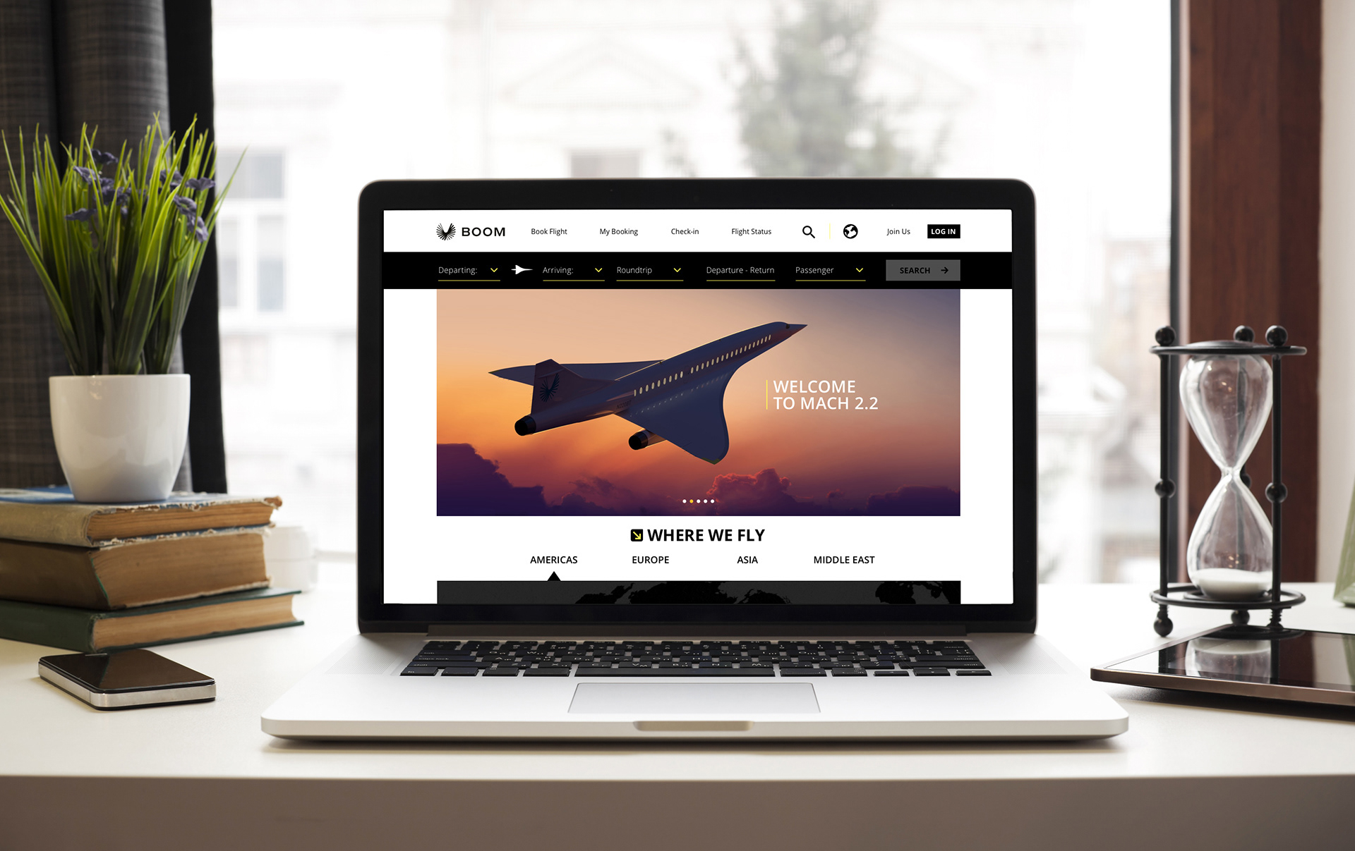
Boom is a fictional emerging airline that wants to revolutionize the air travel segment by reintroducing supersonic travel. Its aircraft are capable of flying the same distances as regular airliners but at twice the speed of sound and, most importantly, at rates that are affordable. For this project a responsive website was designed and a working desktop prototype was created highlighting the booking experience.
Research
Goals
• Understand how users interact with and book a flight on a mobile website
• Understand how users interact with and book a flight on a mobile website
• Understand if there are any unmet needs during their experience and how they feel about it
• Identify features that help users complete their goals and what are their pain points
Market Analysis
The most interesting finding when conducting a market analysis is that the experience varies wildly across the board and most of the top companies either feature a website or a mobile app. The main red flags are that some companies have an excessive amount of information, forms that are not only long but clear the fields if you navigate to other pages and a pricing structure that often has hidden costs. Lack of flight updates and site performance are also an issue on some cases.
The most interesting finding when conducting a market analysis is that the experience varies wildly across the board and most of the top companies either feature a website or a mobile app. The main red flags are that some companies have an excessive amount of information, forms that are not only long but clear the fields if you navigate to other pages and a pricing structure that often has hidden costs. Lack of flight updates and site performance are also an issue on some cases.
Interviews & Findings
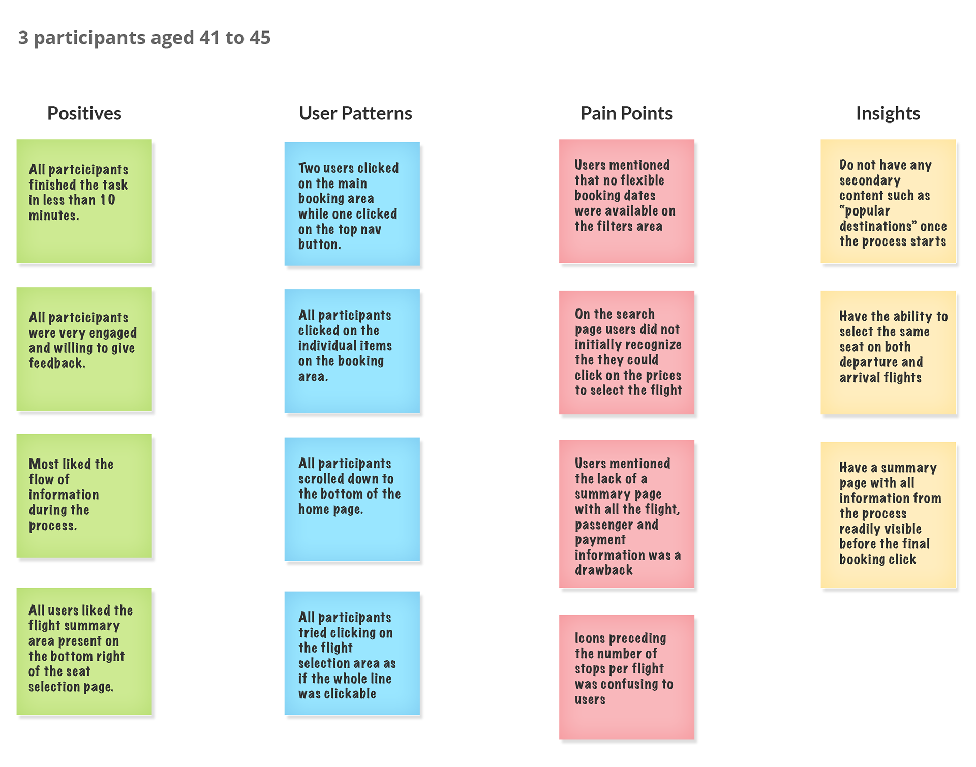
I completed 3 contextual interviews to understand how the participants experience their flight booking process. I’ve learned what website and tools they use and their preferences and struggles while trying to accomplish their task. All participants are frequent flyers aged between 42 to 45. Two participants fly at least twice a month, one flies approximately once every other month.
I completed 3 contextual interviews to understand how the participants experience their flight booking process. I’ve learned what website and tools they use and their preferences and struggles while trying to accomplish their task. All participants are frequent flyers aged between 42 to 45. Two participants fly at least twice a month, one flies approximately once every other month.

Positives and likes
• Websites with a clear and straightforward booking process
• Websites with a clear and straightforward booking process
• Selecting flights according to arrival and departure times
• Filters that also gives recommendations based on approximate results
• Charts that show the fares of trips that are near the given dates
• Flexible date selection for flights
• Ability to select the number of stops when conducting a search
• Rewards programs
Pain Points
• Filled forms that do not save data when going back to previous page
• Not being able to select flights based on arrival and departure times
• When a query results in zero available flights without recommending alternatives that match
more loosely the original query.
more loosely the original query.
• Some sites present too much information and the rates and fees are not clearly shown
during the process
during the process
• Mobile experience while functional is challenging due to screen size
Strategy
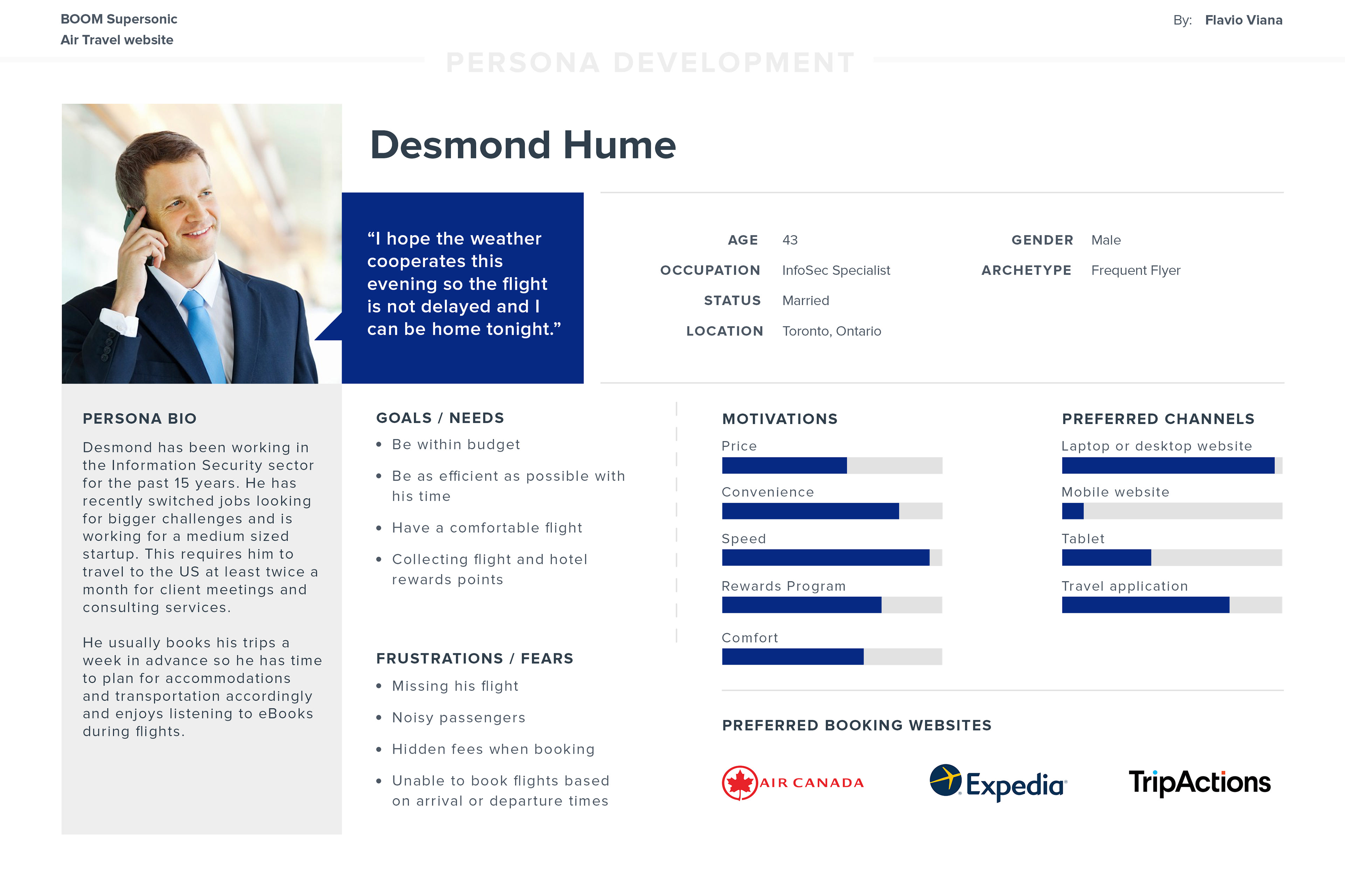
Desmond is the result from our market and user research interviews. He helped us understand how one goes through the booking process for business travel and what are the expectations, motivations and struggles encountered.
UX Design
User Flow
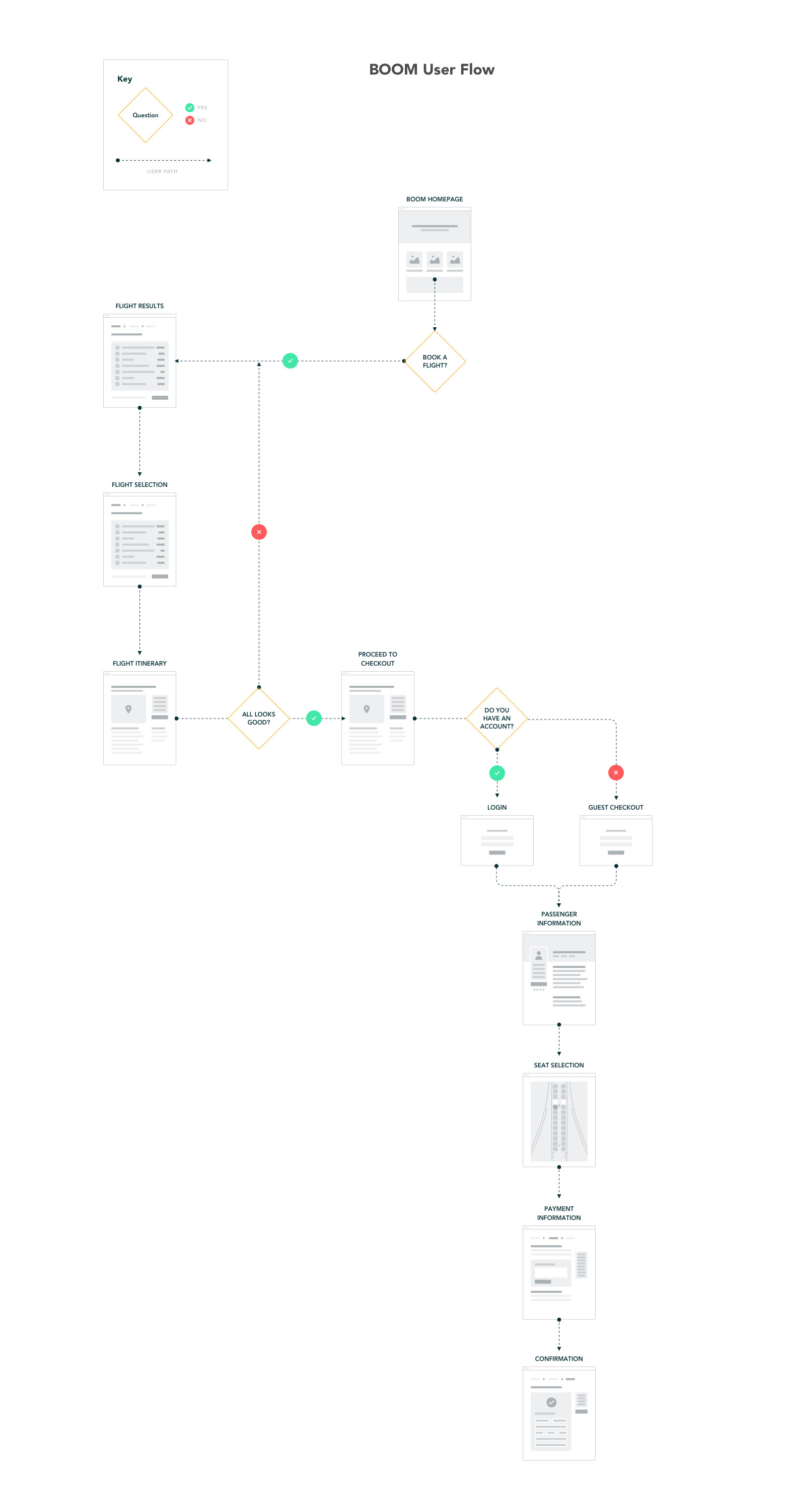
Based on the storyboard scenario a user flow was created to serve as a baseline to the wireframes and UI design. The selected flow displays how a user arrives at the home page and proceeds successfully through the buying process.
Sitemap
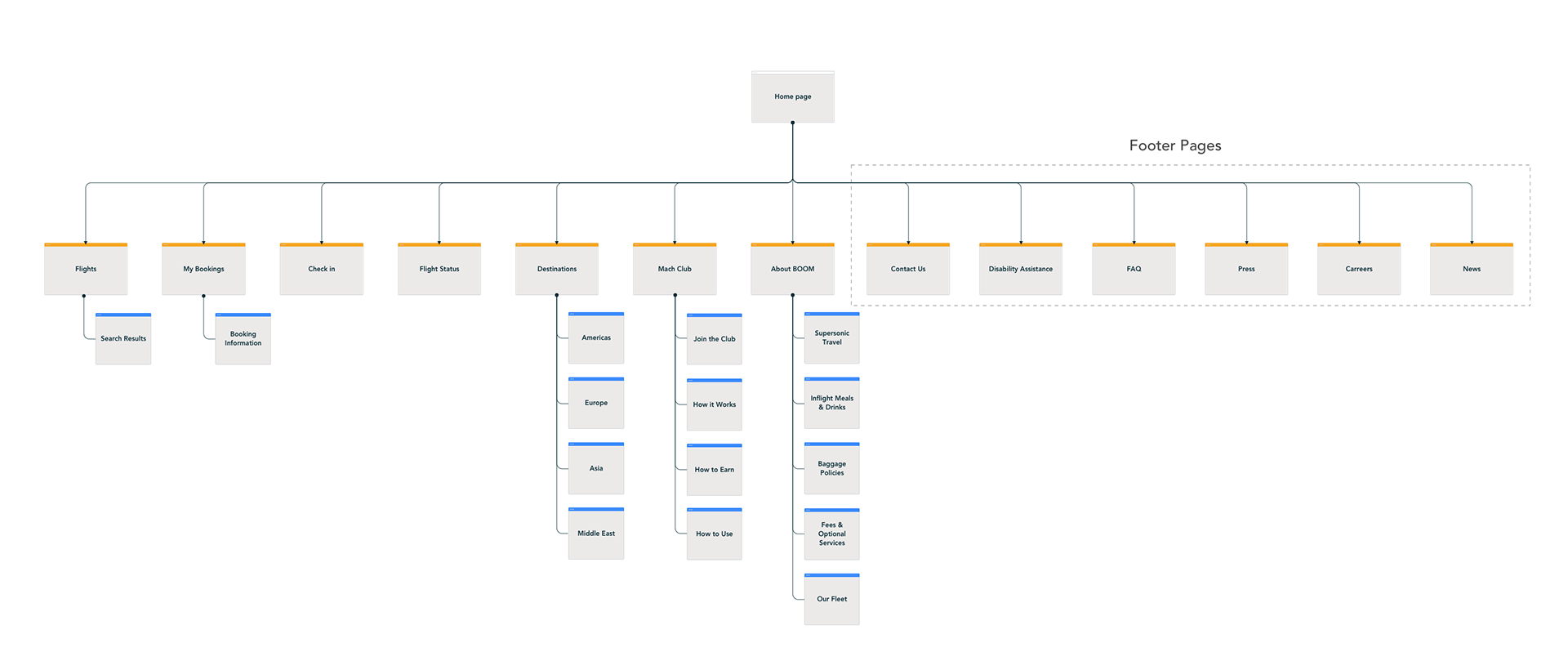
To have a clear understanding of content structure and hierarchy a sitemap was created.
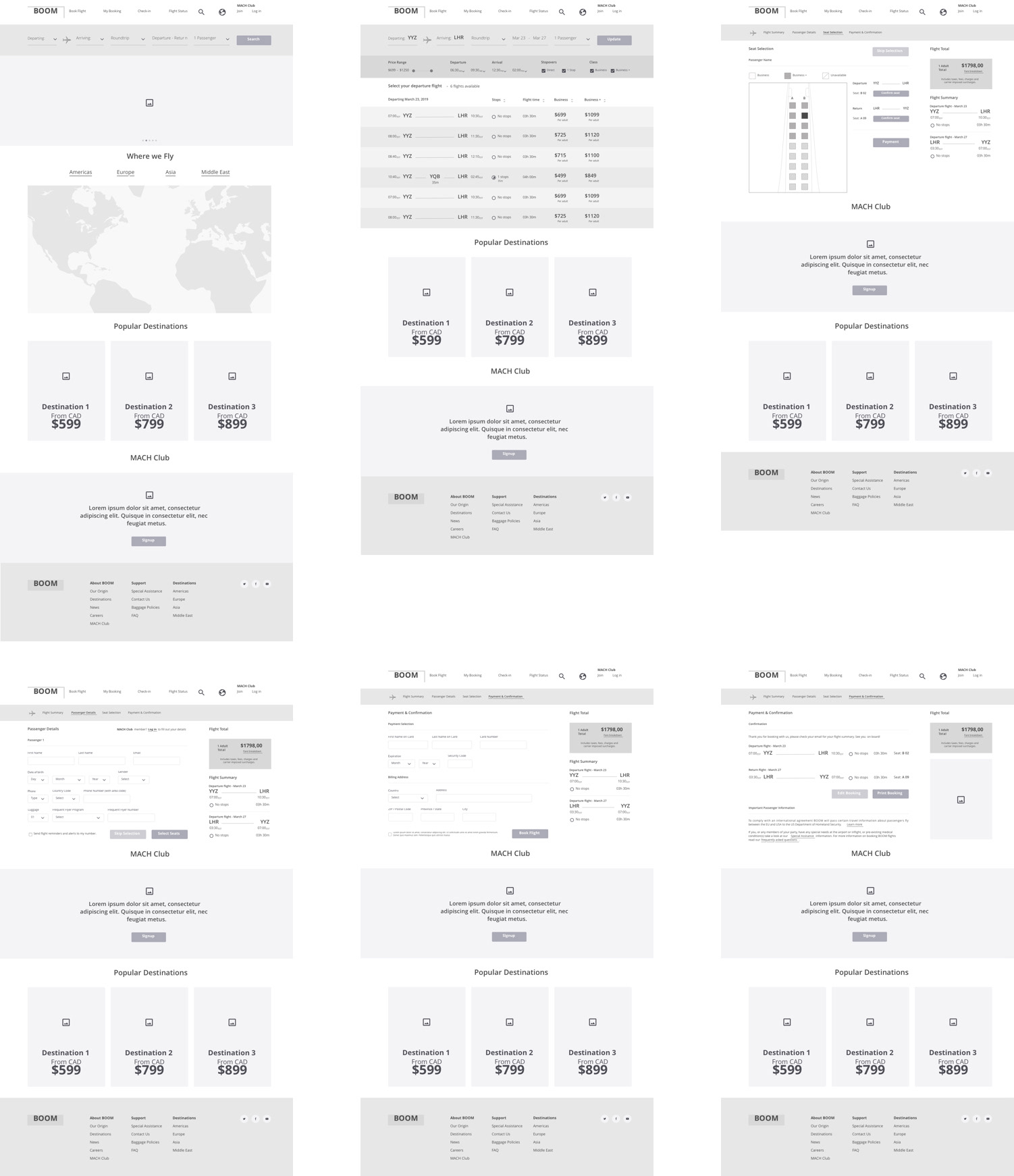
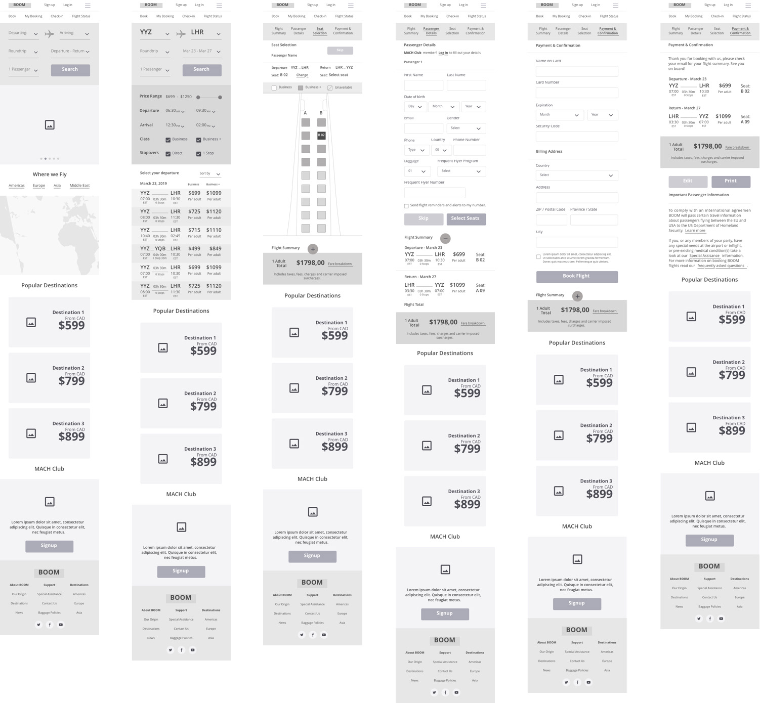
Wireframes - Mid level
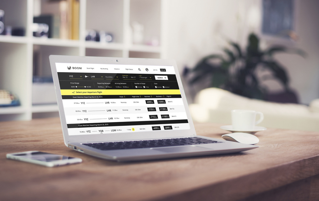
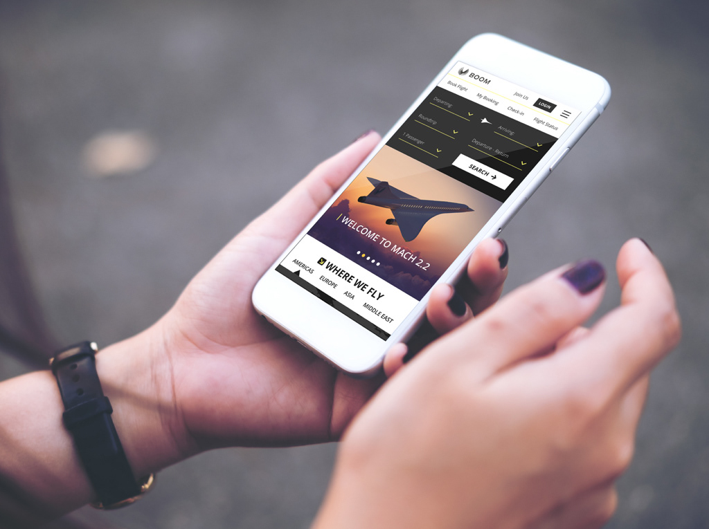
I designed medium level wireframes in mobile and desktop versions of the booking process in Sketch and from them a prototype was built in InVision for usability testing and validation.
Desktop Version
Mobile Version
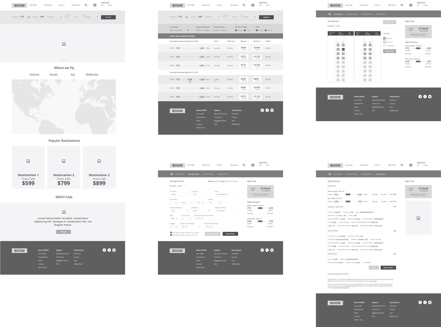
Wireframes - High Level
After the mid level wireframe testing I iterated on the results and created a high fidelity version in desktop format for further user testing. This was due in part that all participants only utilized a desktop platform to conduct booking.
Affinity Map
From the research data and prototype testing I created an affinity map to illustrate what was the direction I needed to go and what the insights were.
Visual Design
After the conclusion of all the research and testing phases I proceeded to create the visuals for the final website experience.
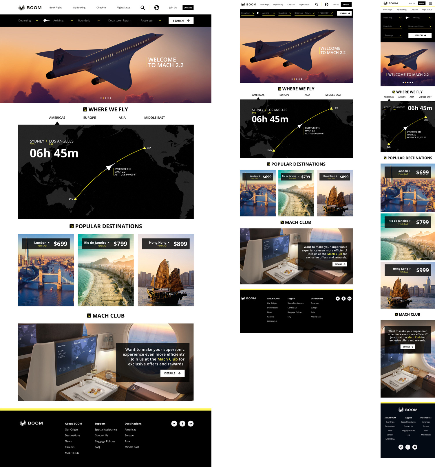
Applications
Final Reflections
This project enabled me to see and understand the complexity of a flight booking procedure and how business travelers utilize the systems available to them. All participants were thrilled that the speed of the aircraft would enable them to make better use of their time and be able to have distant meetings in one day. They enjoyed experimenting with the final prototype, how the visuals were straightforward and the information simple to understand and that they can opt in for flight changes and notifications through email or text.
One of the most important lessons I learned is the fact that none of the participants use a mobile site or app to book a trip. Not only do they prefer a website but also the screen size that comes with a desktop computer. They also always book a flight with at least a week in advance in order to have time to organize their schedule. Ultimately, they were all very excited about the speed of the trip but took their time during the booking process.
One of the most important lessons I learned is the fact that none of the participants use a mobile site or app to book a trip. Not only do they prefer a website but also the screen size that comes with a desktop computer. They also always book a flight with at least a week in advance in order to have time to organize their schedule. Ultimately, they were all very excited about the speed of the trip but took their time during the booking process.